croat creations
Croat Creations is a conceptual brand celebrating Croatia’s hidden brandy-making traditions through bold, modern design. Rooted in secrecy, family, and cultural pride, the identity blends vintage textures with contemporary visuals; turning every detail into a nod to something only Croats would know.
project type:
project tools:
Brand Design, Logo Design, Packaging Design, Motion Graphics Design, Illustration Design, & Print Design
Photoshop, Illustrator, Premiere Pro, Firefly, After Effects, & Procreate


brand identity
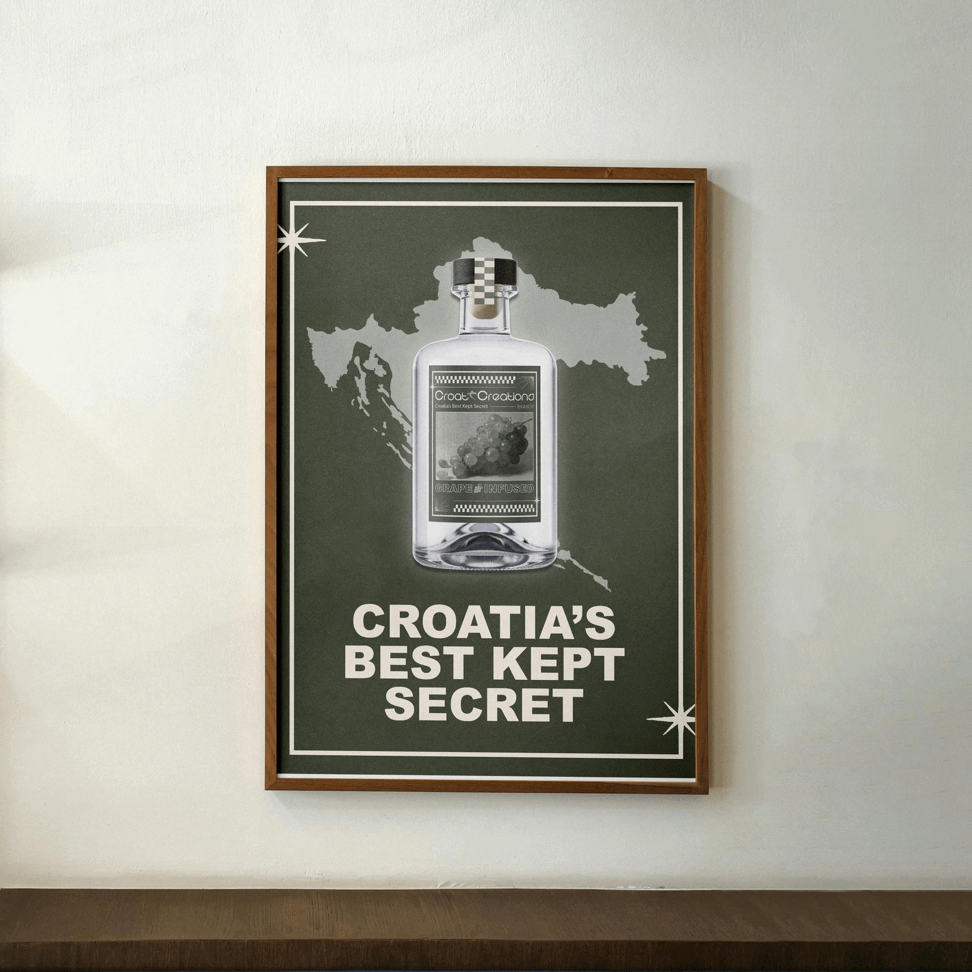
For Croat Creations, I combined cultural authenticity with a modern aesthetic. The logo places a silhouette of Croatia between “Croat” and “Creations,” symbolizing national pride and acting as a visual separator. Geometric, rounded typography gives a youthful, approachable feel, while the Croatian cutout ties into the tagline, “Croatia’s Best Kept Secret.”
Supporting icons like grapes, plums, brandy bottles, and the Croatian flag highlight traditional ingredients and heritage. A repeating checkerboard pattern, inspired by the Croatian coat of arms, and a muted, earthy palette give the design a refined, artisanal touch while keeping it modern and design-forward.

packaging & business card visual language
The Croat Creations packaging brings the brand to life with playful, ingredient-focused labels and bold typography. Subtle design details, like the checkerboard border and clean icon placement, give each package a polished, artisanal feel while highlighting the brand’s cultural roots.


Business cards and boxes continue the brand’s visual language with a custom icon pattern that reinforces identity. The cards have a clean, minimal layout with clear hierarchy, while the boxes use the pattern and branded tape to turn packaging into a showcase of craft, authenticity, and Croatian pride.


poster visual language
The left poster features Croatia’s silhouette behind the bottle, paired with the tagline “Croatia’s Best Kept Secret” for a clean, impactful look.
The right poster brings warmth with an illustration of a Croatian grandmother (“Baka”) enjoying peach brandy. The combination of soft and strong lines, a neutral palette, and the grandmother illustration highlights tradition and family, showing Croat Creations as more than a beverage and as a celebration of heritage and togetherness.