better living fitness center
We partnered with Better Living Fitness to redesign their mobile app, the central platform connecting trainers with clients. User testing uncovered key usability challenges among their primary audience of adults ages 55 to 80. Our redesign simplified navigation and streamlined the experience, making the app more accessible and better aligned with Better Living’s mission of supporting health and vitality.
client:
Better Living Fitness Center
project type:
User Research, User Experience Design, & User Interface Design
project tools:
Figma, Procreate, Photoshop, Illustrator, Google Docs, & Qualtrics
project team & roles:
4 UX/UI Designers, 1 Research Lead, 1 Design Lead, 1 Reports/Logistics Lead, & 1 Stakeholder Mediator Lead


background
Our team partnered with Better Living Fitness, a gym in Ann Arbor, Michigan, dedicated to helping adults ages 55 to 80 improve energy, vitality, and overall well-being through safe exercise, balanced nutrition, and self-care practices. Their mobile application is the primary platform for communication between trainers and clients, providing workout plans, resources, and updates. We were tasked with enhancing and streamlining this app to create a more user-friendly, engaging, and effective experience for their members.
project goals
Our project focuses on three main goals: understanding our audience through data collection, refining the existing design based on evaluation, and building a strong foundation for our client to expand on in future updates.

my contributions
Our team consisted of four members, each serving as a UX/UI Designer while also taking on an additional role. Along with my design responsibilities, I served as the Research Lead for this project. My main tasks included developing research questions for participants, conducting in-person user testing at the Better Living Fitness Center, and analyzing the resulting data. Beyond research, I also designed the “Workouts” overview screen and the "Login" screen of the application.

ux project roadmap
In taking on this project, our team prioritized research, user testing, and consistent client communication to successfully navigate the application’s complex workflow, meet project goals, and satisfy both client and user needs, with a strong emphasis on improving user interface accessibility.

data collection & insights
data collection process
We utilized a Qualtrics questionnaire, which was emailed to Better Living Fitness Center members to screen out potential participants under 25, ensuring responses aligned with our primary target audience of middle-aged and older adults. After narrowing down participants, we conducted in-person user testing on the original user interface design using a scripted interview to better identify where users experienced pain points within the application.

data insights
After completing rounds of user interviews with the original interface, we gathered the following insights from our participants.

user personas
From our user interviews, we created two personas, Professor Jane Fishman and Accountant Douglas Craig, to guide design decisions and keep the project focused on Better Living Fitness Center’s users.


design stages & insights
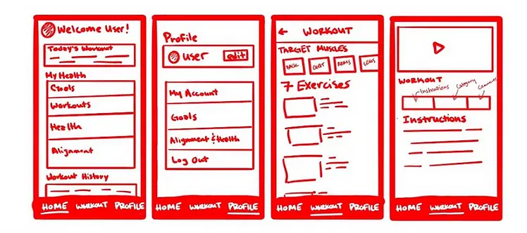
low-fi sketches
After completing our first round of user testing with Better Living Fitness Center’s original design, our team created the first UI iteration by starting with paper sketches and then moving to a digital version. This design aimed to simplify app navigation through a universal navigation bar, clearer labeling, and cleaner, less cluttered layouts.

sitemap & comparative analysis
To ensure a clear understanding of the application’s structure, our team created a sitemap diagram based on Better Living Fitness’ original design, as the client preferred to maintain the existing user flow. Due to project time constraints, we focused on three of the app’s four main pages: the homepage, workouts page, and profile page.
At the client’s request, we also produced a comparative analysis to offer insights and ideas for potential future feature enhancements.


mid-fi prototype
Following the completion of the low-fidelity design, sitemap, and comparative analysis, we proceeded to develop the application's mid-fidelity prototype.
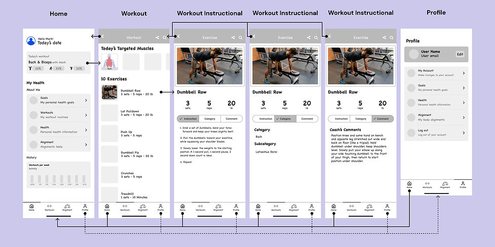
high-fi design, interaction flow, & screen design insights
After conducting additional user testing at the Better Living Fitness Center facility, our team developed the final high-fidelity design for the client, accompanied by detailed interaction flows and screen functionality insight graphics.
interaction flows
The diagrams below illustrates the user interaction flows for starting a workout, performing an exercise, and completing a workout.


screen functionality insights
The graphics below provide detailed insights into the functionality of each screen in the Better Living Fitness Center app redesign.


